Thursday 30 November 2017

Christmas Flora


Christmas Flora


Hallo Everyone!

So, here comes our second
dip into the realms of Flora to
be found at Christmas time

Craftyfield is centre stage
today:


"Sometimes I need to wrap a present 
and find myself without the right paper.

I don't know about you but I wrap a lot
 of CD and video/games cases and I hate cutting
 a small shape in a large roll, so much waste... 

Also, with wrapping paper the shape gives 
the game away immediately so I like
 to use bags for those gifts.

How about some options to create your own, 
quickly and easily, with supplies you 
already have ....


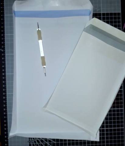
My first option is to transform envelopes
 into bags. A C5 envelope works well for 
CDs and a C4 (letter size) for video cases.

First decide on the depth of your bag and
 score the envelope on 3 sides at half the 
depth you require. 

My large envelope has been scored at 
2cms to give me a depth of 4cms in the 
finished bag, which can easily accommodate 
2 video cases.


Before the next step in the construction 
of the bag, it is time to decorate 
whilst still flat... 

Here I chose to create a Gelli print with 
stencils (I used Andy Skinner's Sunburst and 
Imagination Crafts Drop Screen)


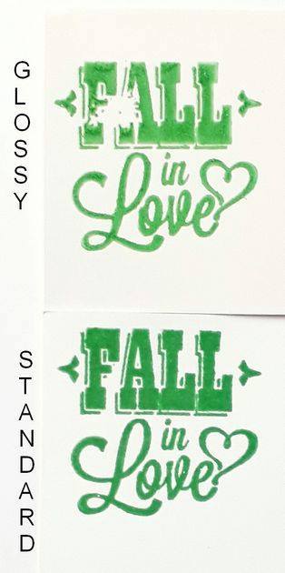
 Adding the large Woodware snowflake
 twice embossed. First with white and 
on a whim I re-stamped (thanks to the Stamping
 platform) and sprinkled a mix of clear and 
Sea Turtle powders.


I couldn't resist and added the small stamps
 from the same Woodware set in
 Brilliance Starlight silver ink, all over the bag.

For the small bag, I stamped directly on the 
envelope with Versamark and embossed with
 Cosmic Shimmer Brilliant Sparkle Embossing 
Powder in Gold .

 I added the smaller snowflakes 
with gold ink.

For good measure I added both sentiments 
from the stamp set in black ink!


With the bags decorated, onto the construction...

To finish the opening there are many options, 
from a straight cut as I did on the small bag
or more elaborate using border punches, dies, 
adding handles with ribbon or twine etc...

For my large envelope, after cutting off the 
sticky flap I folded about an inch to the inside 
to get a more sturdy base for my 
twine handles.

Form the shape of the bag by pushing open 
along the score lines with your hand inside 
the envelope.

The photo shows a side view of the bag 
with the formed triangular flaps to be
 stuck under.


The bottom of the bag should look like this
 and double sided tape is applied on the small 
triangles and stuck down to the bottom 
of the bag.


 If you don't have envelopes or don't
 fancy using them, how about designer papers?
 Bo Bunny and Kaisercraft have gorgeous
 designs and the paper is of a decent weight 
for the purpose. 

You can also use your Gelli prints...

Or you can use cardstock, from the standard 
card to Mirri and of course Glitter card
 (if you're like me and hate being covered
 in glitter, go for non shedding).

I created this simple template above for
 a bag to be cut out of a standard A4
 sheet with the least waste. 

If using 12"x12" it is easy to adapt the design 
by extending the drawing. Just remember to use
 the same measurements for the bottom flap 
and the right hand flap as this is what decides
 the depth of your bag.


 Here's my 2 A4 pages cut and scored. 
One option is to add scoring lines at the 
top and fold the top closed in a box shape


I went for the bag look and added handles
 by die-cutting them with a rectangle shape. 

I can thread a ribbon through it to keep 
the bag closed to thwart the curious...


That large snowflake stands on its own
 perfectly as a center piece and I embossed 
it using that gorgeous Frantage embossing
 powder in Shabby Rose.

To make up the bag use double sided 
tape on both tabs (the 1cm wide seen 
on the left on this photo), both side flaps and
 one of the large flap which will be at the 
bottom of the bag. 

This bag is the perfect size, and sturdy 
enough, for a (thick) paperback.


Just for you a close up of the shiny bits..."

Supplies:


Great idea there with the
envelopes Craftyfield.......not
to mention what you have
put in them....

That's my present list sorted
and wrapped!  

'Till tomorrow

Mickie xx


Wednesday 29 November 2017

Christmas Flora


Christmas Flora


Hi There!

It's nearly here..... that most
wonderful time of the year, as
the song goes.

Thought we'd take a look at
some Christmas images from
the natural world.........

So to start off on our quest
for Christmas Flora, here is
Jane Castle:

"For my project this week I've chosen 'Holly & Ivy' 
as I love cutting these from the garden and 
decorating the house over the Christmas holidays. 

This time I've decided to move away from 
the traditional greens and use various blue hues 
with some added sparkle.

To begin with I coloured some white card 
with Distress inks, stains and PA Infusions.


This was then stamped and heat embossed
 for my ivy leaves and also die cut for my 
holly borders.


Next I stencilled the top left-hand corner 
and the bottom right-hand corner of my card blank 
using Iced Spruce and an Imagination Crafts stencil.


Grunge paste was then applied through my
 Tim Holtz stencil.

 I masked off areas around the word Christmas
 so as not to end up with any unwanted splodges! 
( so easily done)


The stencil was removed, cleaned and replaced 
to add Merry above as I found it easier 
to centralise the longer word first.

The Grunge paste was then covered in 
glitter whilst still wet.


The holly border was trimmed to size,
 dots of Liquid Pearls in Pewter were added
 for the holly berries and finally the ivy leaves 
were shaped and stuck in place.


Then looking at the stencils I'd used I thought
 of other ways of using everything previously 
prepared for the card. 

I cut some large white card tags and 
came up with the following:


This had the addition of a couple of 
self adhesive gems.


This one had Ranger Perfect Pearls brushed
 onto the stars and I used another die from
 the same set.


The holly border was trimmed using the 
corners rather than the long sides.


And finally on this one I applied the 
grunge paste through the other stencil
 creating a completely different effect.

I could have done many more variations 
and all of these could easily be adapted 
for cards.


So for just under £25 for the 2 stencils, 
the die set and the mini stamp I could
 make all of this years christmas cards and 
tags without getting much more out on 
my bench ---- that's got to be good value!

I have now decided to make several 
batches of the large tags in different 
colours, place 4 different ones in a cellophane 
bag and give them to my Mum's care home 
to sell at their Christmas Fete."


Items Used 


You have certainly started
us off on the right track
Jane.  Thank you for a
lovely idea too - those sets
should sell very well at
the Christmas Fete

'Till Tomorrow

Mickie xx


Sunday 26 November 2017

New in Stock

New in Stock


Happy Sunday Everyone!


A little on the late side - was
going to leave you all in peace
today but when this wonderful
article by our very own
Craftyfield popped into my
in box I just had to share it
with you.  I would suggest
you make yourselves a nice
cuppa and perhaps help
yourselves to some cake 
or a biscuit or two and
settle down with your feet
up to read on.....

Craftyfield has taken the new
Versafine Clair Inks and put
them through their paces.

Here is what she found:


"Tsukineko VersaFine Clair ink is a fast drying,
 oil based pigment ink. Like the old Versafine, 
the raised inkpad, allows direct to paper
 inking, as well as inking stamps. 

The cases have been redesigned and are now 
air tight and therefore should last even 
longer than the already long lasting Versafine. 

This new line of VersaFine inks is available in
 great vintage and bright colours, 24 colours in total,
 so you should find the exact shades you need!


The first thing I noticed when inking stamps
 is how thick the layer of ink is on 
top of the stamp, allowing for a deep colour. 

I had forgotten how juicy the old Versafine pads 
were as, one of mine is nearly completely dry 
and the other half way there. 
Still, I have had the first one for over 10 years…


Compared to the old Versafine inkpads, 
the new ones have lost their hinged lid, 
have a shorter depth, 1cm less for the same width. 

The inkpad is raised a little more than
 the old ones too, so it is easier to do direct to
 paper inking. 

The cases stack very well, with more of
 a snug fit than the old ones.


 First I tested the ink on different surfaces, 
comparing the Versafine Clair
with appropriate inks for the substrate.

On card, the Versafine Clair dries quickly and
the image is more solid than with Memento.

On glossy cardstock the Versafine Clair image 
is much brighter, and the ink appears to stay on
 top unlike the Memento, which sinks in. 
It does however dry very slowly and it is 
possible to smear a little, even after
 drying for 24 hours. 

I tried heat setting too, to no avail so if you
 must stamp on glossy with Versafine Clair
you will need to emboss.

On fabric, whilst the Versafine Clair stamps well,
 the details are blurred a little as the ink sinks in 
the material and the Archival gives the best results.

On acetate, no surprise there, Tsukineko do 
not recommended Versafine Clair for stamping 
on non absorbent surfaces and acetate is 
not absorbent at all. 

Overlooking the bad stamping (user error!), 
even Archival has trouble with such a slick 
surface but at least does dry, albeit slowly, 
and can be heat set. 

For acetate, there is only one ink that does the 
job reliably in my view and that is Staz on. 

On watercolour, the Versafine Clair impression 
is that little bit more solid, compared to 
the dye ink. Most of the texture you
 see in the photo is from the paper’s cold
 pressed grain. 

[I re stamped a small portion in the blue inks 
I used for the card and glossy samples
 to check whether the difference in colour
 was due in part to the shade chosen, and it is].

Versafine Clair is recommended for use with 
watercolours and I applied a wash of yellow 
ochre without any problems.


On acrylic paints, like acetate, the surface 
is non absorbent and the ink will not dry and 
needs to be embossed. 

This is also true for Gesso, as you
 can see in the photo on the right,  the ink 
has spread and the image has lost a lot of detail.

Use Versafine Clair on all absorbent surfaces 
(non coated cardstock, wood, fabric etc..) 
and avoid on slick/non absorbent surfaces 
such as glass, plastics and coated papers, 
unless you are embossing the ink.


Versafine Clair ink embosses well on both 
Glossy and standard card. 

The colour is deeper on card, because 
of its absorbency, and you must work quickly
 to get a good result.


 In the perfect stamping equation, 
in addition to the ink and the surface, 
there is one other variable, 
the stamp itself. 

Rubber isn't problematic but
 clear stamps can be...

First up I tested a polymer stamp, and 
clearly Versafine Clair comes on top, 
with a smooth and deep colour compared
 to the patchy impression of the dye inks 
(Distress and Memento) 
and weak colours of the pigment ink 
(Versacolor).


On acrylic stamps, the ink tends to 
bead up on them and produce even more 
patchy results than with polymer stamps. 

Compare the look of the Memento ink above 
to the thick layer of Versafine Clair shown earlier, 
the difference is striking!


With Versafine Clair the print is solid and 
perfectly detailed.

Unless you are prepared to take your 
sanding block to the acrylic stamp, 
Versafine Clair should be your first choice 
of ink, unless you are stamping on 
non absorbent surfaces!


 Now for the litmus test! 

I have pulled out my most detailed photographic
 stamp, which is very difficult to ink as it 
hasn't got any deeply etched lines (the 
image is formed of half tone-like minute dots). 

It is easy to see already from the inked 
stamp that the Versafine Clair is performing 
much better than the Memento and the
difference in the stamped image is convincing. 

The new inks passed the test with flying
 colours and I, for one is a happy bunny! 

Like the old Versafine, the Versafine Clair is 
made for detailed stamps and superior 
to all other inks I've ever tried.


On to colours. 

Colour is a personal choice, if you stamp
 lots of florals you will get some pinks, blues
 and green, whilst if you are into Vintage 
images you will choose from the darker
 colours and browns. 

To help you choose I photographed 
the 6 colours I had to test next to 
their respective lids and can confirm
 the lid images are true to the ink colours.

Personally, I'd like to get 3 shades (light,
 medium, dark) in the greens, blues and
 pink/reds, to use on layered flower stamps 
(multi-step stamps) and a brown, black, grey... 

Well, space allowing I'd have them all 
but if not, you can (preferably with a stamping
 platform) overstamp one colour with another
 to get a 3rd shade. 

I tested how the ink layers on itself by 
stamping the pink on top of the yellow 
to get the orange you see in the upper 
left corner.

Finally, as to colouring mediums you can use 
on top of Versafine Clair, both alcohol and 
water based media, can be used like the
 old Versafine. 

If using coloured pencils, refrain from using
 a solvent to blend the colours as this will 
interact with the oil in the ink.

In conclusion, although there isn’t a holy grail

 of ink able to handle all surfaces, stamps and 
colouring mediums - trust me I've been on
 that quest and gave up a long time ago - 
Versafine Clair is a pretty good all rounder,
 a beautiful ink for detail and strength of colour.

It's an emphatic YES from me!"

xXx

Thank you for such a super in-depth
look at the product Craftyfield.

I had wondered if I really need yet
another set of inks and now that
I've read the results of your
researches I clearly do need yet
another set of inks.......................!

Are you there Santa?  Are you
listening?!!

'Till tomorrow

Mickie xx