
Vintage Chic
Hi There!
Hope the week is treating you
kindly and the work not piling
up around you...............
I'm thinking it might be nice
to at least catch sight of my desk
for a change.....................of
course, this means I shall have
to do a spot of housekeeping, or
should I be calling it "craft keeping"?
While I start on that, I'll leave
you with Jane Castle who has a
beautiful project to share with you
"Great topic and these new stamps from
Blue Fern Studios fit the bill so well.
For the vintage feel I wanted to create a
postcard with the feeling of something
that had been in a shop window for a
couple of years and been bleached
by the sun------
I hope you think I was successful!
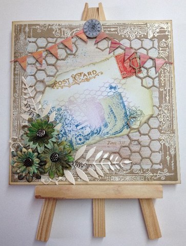
I began by stamping the postcard part first
so as to gauge how everything else
would fit together.
Postcard was stamped in Vintage Photo
Distress Oxide ink and spritzed with water.
The main image was from Blue Fern Studios
Country Garden stamp set, this was inked in
Archival Cornflower Blue, then parts were wiped
with a new baby wipe and then re-inked in
Starlight Silver and Pearlescent Olive.


The banner/bunting was cut from card that had
been coloured with Brushos and painted with Satin Glaze.

The flowers were from an old pack of paper
flowers that I found in my stash.
I sprinkled them with the Dark Brown Brushos
and then sprayed with Prima Color Bloom.
These were paired up and attached with metal brads.
A few leaves were die cut to go under the flowers.

A couple of twists made from some jewelry wire
and finally a shrink plastic clock for the top.

This brand of clear stamps were new to me
and I have to say I've been very pleased
with them. One feature I really like is that
on the larger stamps where there is more
than one image they are easy to utilise and
mix and match."
Thank you Jane, I think you've captured that
been in the window too long
look very well.
What do you guys think?
Nice to have a card with a vintage feel to it.
Once I've found my desk I might make a
card or two in this vein .........
'Til tomorrow
Mickie xx
so as to gauge how everything else
would fit together.
Postcard was stamped in Vintage Photo
Distress Oxide ink and spritzed with water.
The main image was from Blue Fern Studios
Country Garden stamp set, this was inked in
Archival Cornflower Blue, then parts were wiped
with a new baby wipe and then re-inked in
Starlight Silver and Pearlescent Olive.

I then added a little bit of colour with Antique Linen
and Old Paper Distress Ink.
The old postage stamp was attached and
the edges torn and distressed.
Next I coloured my background card
with Dark Brown Brushos which were
activated by painting on a layer of
PaperArtsy Satin Glaze.
Once dry I then lightly sprinkled on some
Turquoise Brushos and spritzed with water,
after about 10secs dabbed with kitchen paper.
Finally this was randomly stamped with second
generation Vintage Photo ink using one of the small
stamps from PaperArtsy ESC03.
Then onto the honeycomb frame work ----
This was achieved by using a die from
Tim Holtz Mixed Media Thinlits set and
cutting the 4 corners.
Although this overlapped in a couple of places
it doesn't matter as the centre is discarded.

The edges were stamped with the smaller
of the 2 stamps from Blue Fern Studios Ornamentals
in Versa-Mark and heat embossed with Aged Ivory EE.
The centre was cut away and the postcard
was slotted into place.

The banner/bunting was cut from card that had
been coloured with Brushos and painted with Satin Glaze.

The flowers were from an old pack of paper
flowers that I found in my stash.
I sprinkled them with the Dark Brown Brushos
and then sprayed with Prima Color Bloom.
These were paired up and attached with metal brads.
A few leaves were die cut to go under the flowers.

A couple of twists made from some jewelry wire
and finally a shrink plastic clock for the top.

This brand of clear stamps were new to me
and I have to say I've been very pleased
with them. One feature I really like is that
on the larger stamps where there is more
than one image they are easy to utilise and
mix and match."
Item List
Blue Fern Studios Ornamentals & Country Garden
Brushos in Dark Brown, Turquoise, Orange and Scarlet
PaperArtsy Satin Glaze
Prima Color Bloom Tea Stain
PaperArtsy ESC03 Rubber Stamp Set
Memory Box Die Gentle Leaf & Simple Banner
Thank you Jane, I think you've captured that
been in the window too long
look very well.
What do you guys think?
Nice to have a card with a vintage feel to it.
Once I've found my desk I might make a
card or two in this vein .........
'Til tomorrow
Mickie xx


